Today’s post is actually two!
And they both contain a Christmas miracle…
Welcome to #1. A link to #2 is below.
Nothing like ending a year with a bang, huh?
Christmas Miracle #1
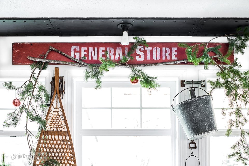
Two years ago, I dreamed what I’d like above my kitchen windows during Christmas. The vision that held strong was a red General Store sign.
Why General Store?
I love stores that house everything under the sun. And I’m not talking Costco style either… I’m talkin’ old school charm…
A historic storefront greets you with a cheery dinging bell as you open the heavy front door with a serious squeak.
Your eyes move towards the tall ceilings, then your eyes follow the shelving right back down to the floor, filled to the brim with everything imaginable. From farm supplies, dry goods, groceries, antiques, speciality items, and of course, the best selection of candy in town housed in glass jars.
Now that’s a store with an adventure!
So with that, I wanted my own version of ‘a candy store’ to make me feel all happy during a season filled with joy. And this year, I FINALLY made it happen.
I was laying in bed super restless because the Christmas decorating just wasn’t coming together yet. And that’s when I got sick of hearing myself overthinking something that never seemed to come to pass. So many reasons how it was harder than it really was…
So I got up the next day and barrelled for the computer, tweaked the file, made the sign and listed the stencil in the store. DONE DONE DONE.
Now that’s turnover…
So! Let’s start with some tips on how I made a new sign look aged with a special wax method, then onto my Christmas kitchen where the sign is now!
(this post contains some affiliate links)
I used:
A plank of wood (mine measured 7.25″ x 72″)
General Store stencil (from HERE)
Fusion Mineral Paint’s Fort York Red and Casement
Find a local Fusion merchant HERE
Fusion’s Furniture wax in Aged
Distressed Board
The board was already painted white and distressed.
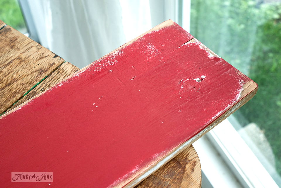
I rubbed the Beeswax along all the edges, then coated the board with Fort York Red.
The edges were then distressed with a palm sander.
Distressed Lettering
General Store was stenciled with a very dry brush method to achieve the distressed look.
The stencil brush was loaded, then most of the paint removed until it was dry to the touch.
I applied the paint by swirling the brush, leaving an intentionally uneven finish.
Once dry, I took a palm sander to the letters and distressed them a little further.
You can learn more about How To Stencil HERE
Aging the board
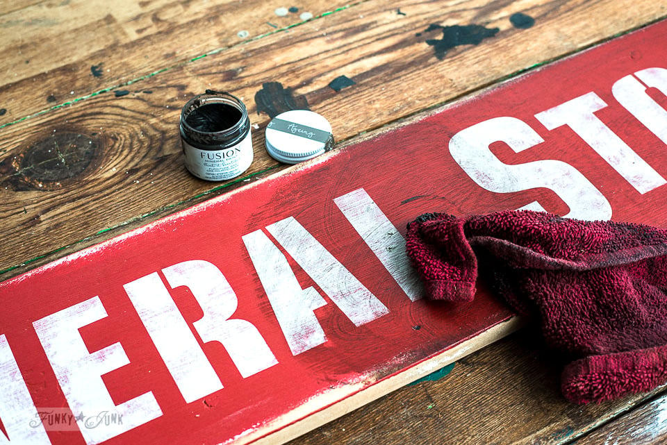
Desiring a toned-down aged red, I applied Fusion’s Furniture Wax in the tone ‘Aging’ onto the board with a rag.
After removing the excess, you can see the amazing tone left behind!
Then I did one thing extra…
I buffed the wax around the lettering super through to remove most of it, then added more wax to all the edges of the sign avoiding the lettered areas. This created a really cool patina that had the letters pop against darker aged surroundings!
See how the board is lighter in the middle and darker on the outskirts? It turned out pretty cool and looked authentically old.
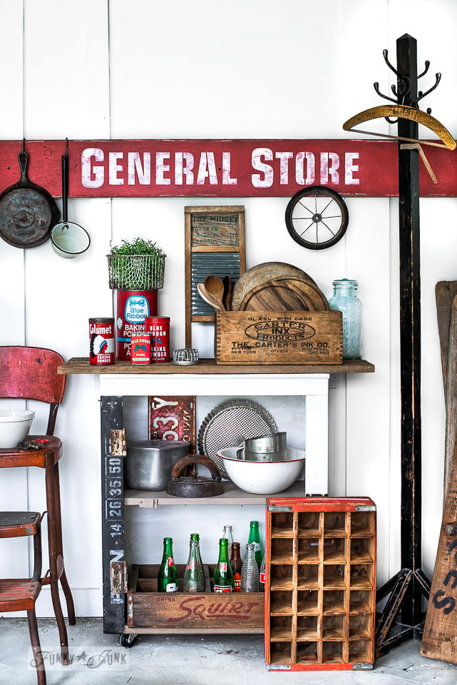
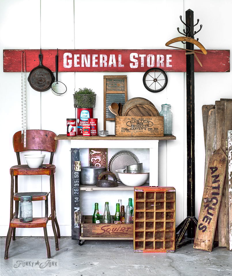
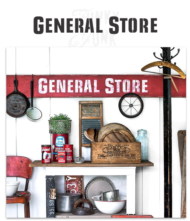
So… welcome to my own little General Store! Won’t you come in and browse around?
As you can see, I chose a really long board so there was lots of real estate to play with on the sign board.
The sign was made to be placed above my kitchen windows so I wanted it long.
I mean… how fun is it to hang stuff off a sign?!
I could see a collection of all kinds of stuff.. wouldn’t antique whisks look cool?
I could seriously play with setups like this forever. I think hanging mugs or using the sign for a pot rack would be super cool too.
How would you use it?
Well, I’m thrilled to say, I finally got my red General Store sign, and of course, the moment these shots were done, I hightailed it into the kitchen…
…. to put it to work for Christmas! Take that tour HERE
It’s a quirky one… but then, aren’t they all?
General Store is a new stencil design from HERE





Love the sign and your new stencil! So cute!!
I like the aging you did with the wax.
Nice addition to your kitchen. Red seems a great accent color for you. And it ties right in with the white lettering with your “new” island.
Keep those creative juices flowing, Donna!
Donna,
You out did yourself with your new stencil and display. I love it all.